FONK Magazine
Digital design - UI/UX Design - Print and Motion Design
As in-house UI/UX Designer at FONK Magazine, I design the mobile app experience and create intuitive, user-centered interfaces that align with the FONK identity.
I collaborate closely with the editors to translate ideas into engaging digital products, while also contributing to visual design across web, print, and social platforms.
Rethinking the App: Insights and Improvements
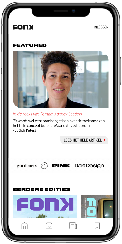
What’s Holding the Homepage Back?
After analyzing their previous app, it appears that the homepage is not engaging due to a lack of clear hierarchy and no call-to-actions. The page consists almost entirely of small, short banners, with the sponsor banners being too dominant.
What Other Apps Get Right
I conducted research on other apps with a similar purpose to identify which features they use. A key takeaway is that larger, more prominent carousels can improve the visibility of the previous editions. Additionally, banners featuring content from the latest edition, such as quotes and visuals with a link to the article, can spark curiosity and encourage users to continue reading.

FONK magazine’s previous app
A Fresh Take on the App
The New Layout
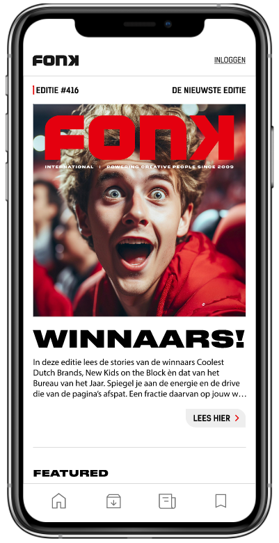
I have added a large banner highlighting the latest magazine edition, including the title, a short introduction, and a button leading to the full edition. Next, a “Featured” banner from an article in the latest FONK edition is displayed. This is followed by the Fonk Library, which shows the last 15 editions in a more prominent, larger format.
I have also included two important elements that are currently missing (shown in the video at the top of the page): the possibility to subscribe, and a Communities & Events section to encourage users to engage with and explore the wider FONK community.
Shapes
The FONK app functions both as a magazine and a news blog. I kept the sharp edges for the magazine sections to stay true to the original physical medium.
For the news and other remaining sections, I combined rounded and sharp edges to subtly resemble a message bubble, giving it a more dynamic feel while keeping the overall design cohesive.
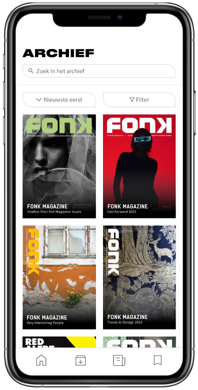
Lots To Read
In the archive, with integrated filtering options, users can easily browse and read the magazine on the go from their phone.
At the same time, news is presented in a clear chronological list, ensuring users stay up to date with the latest updates. Making it quick and easy to find what you’re looking for.

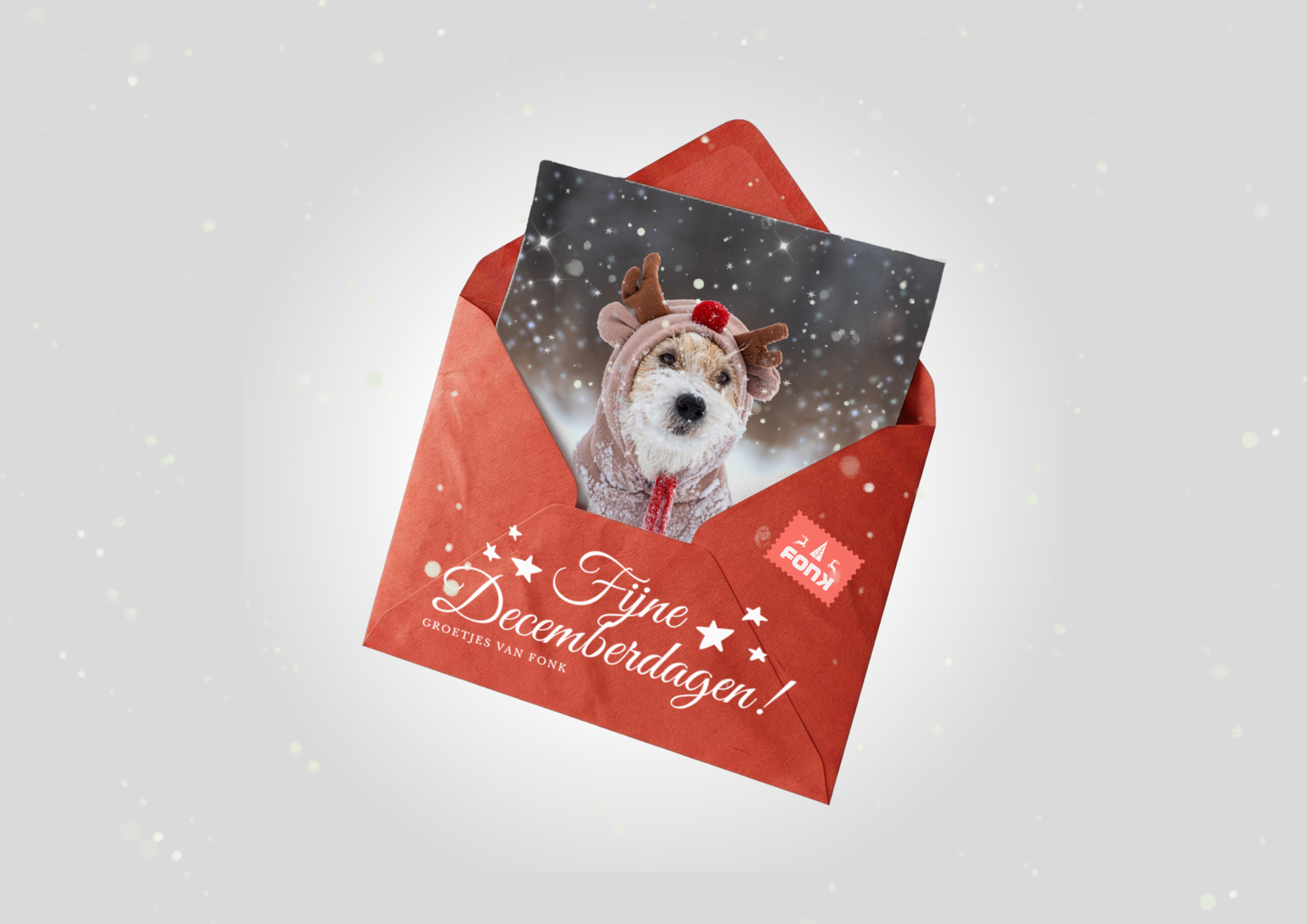
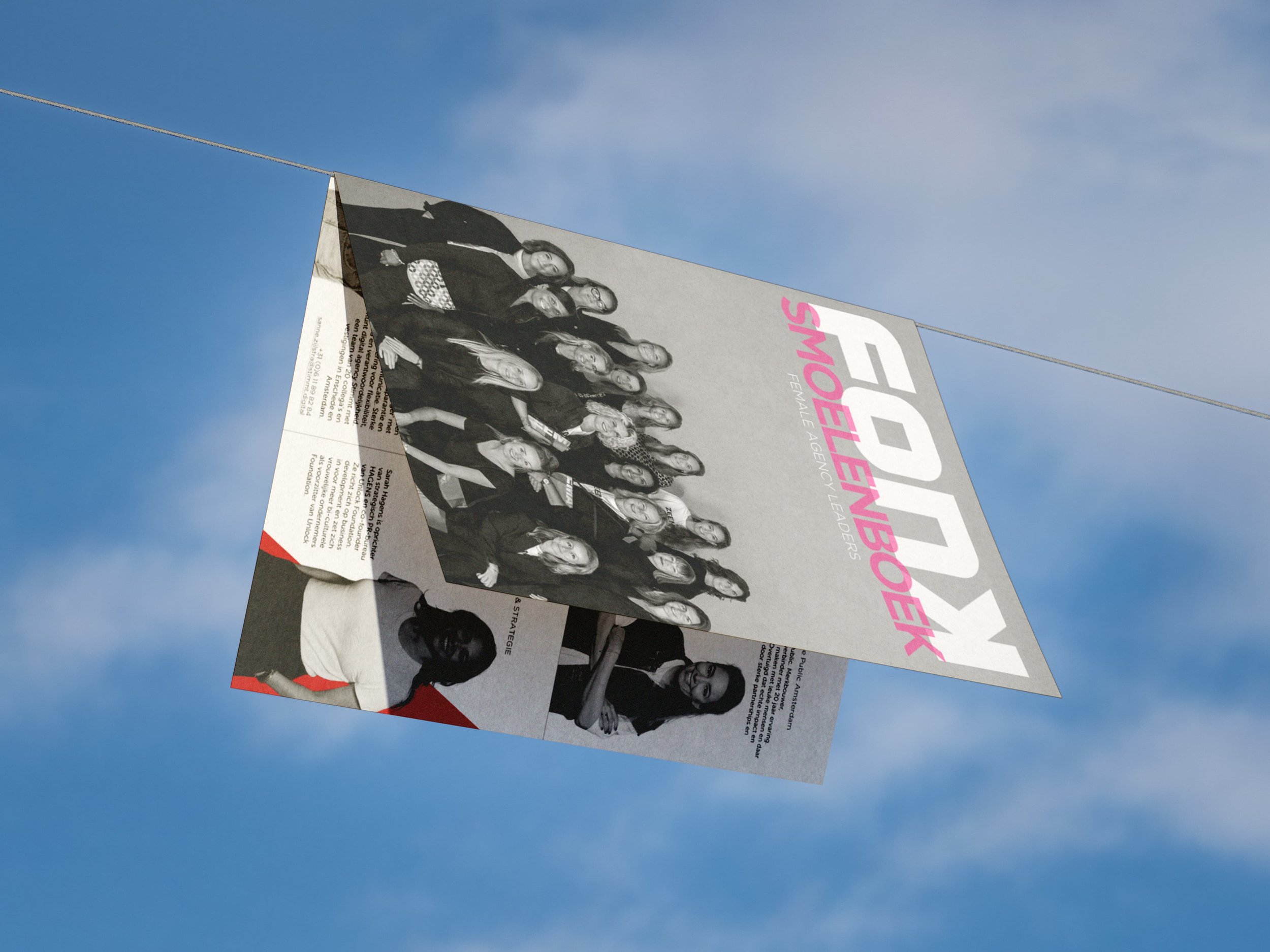
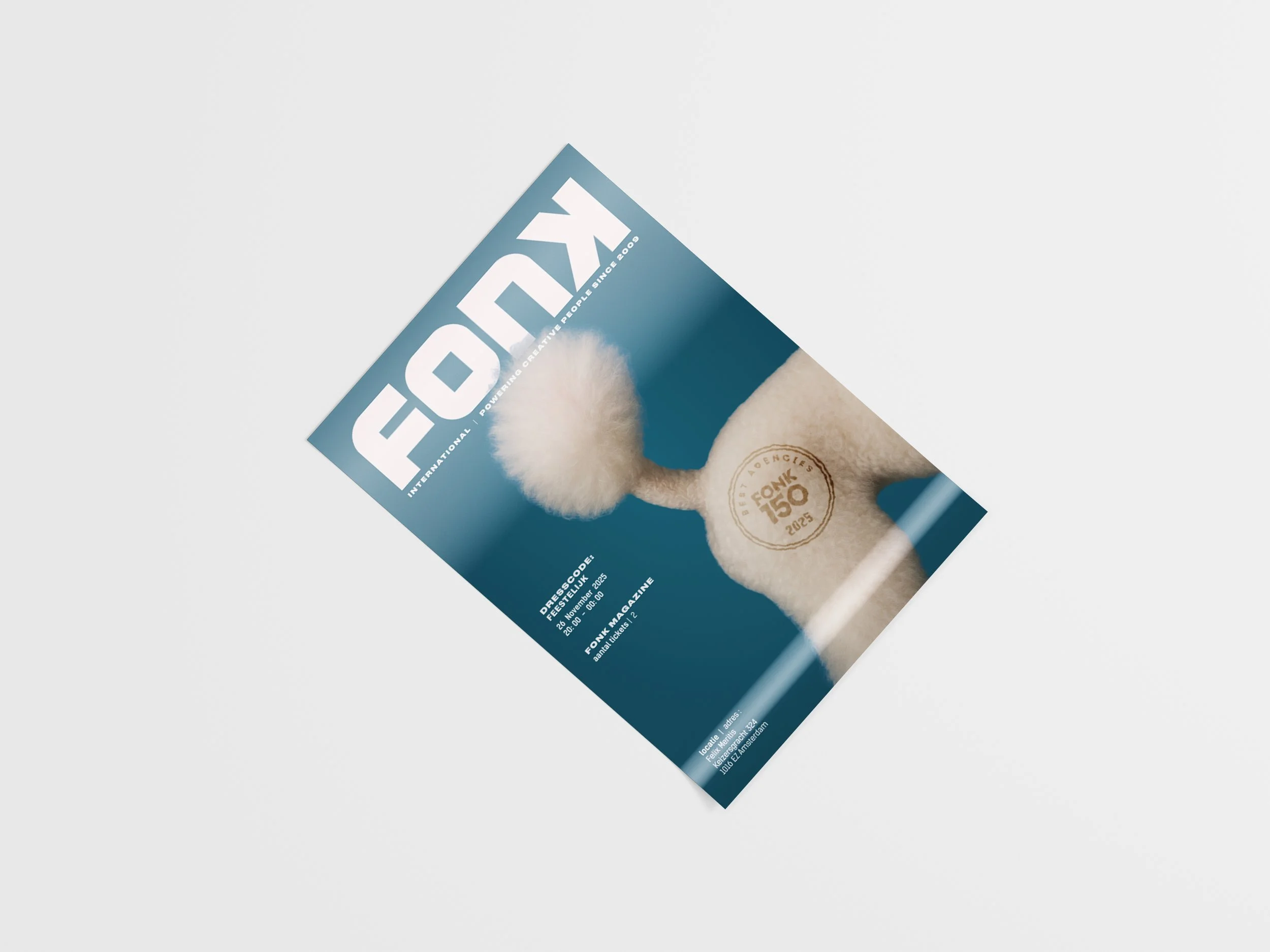
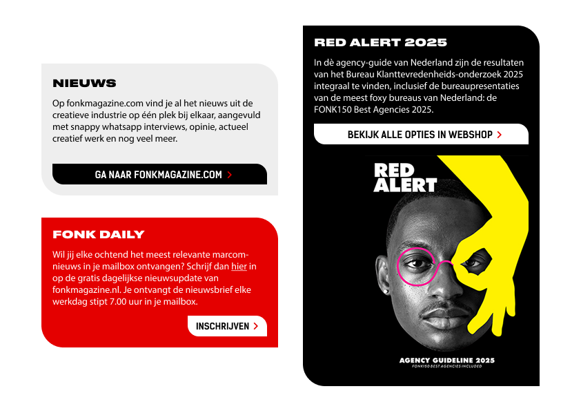
Besides web and app design, I stay busy with print, motion design, and creating social posts that maintain the FONK feel.